This article is part of a series on how to spot a poor Power BI report. There are many pitfalls, which are obvious like 3D Pie Charts, but then there are others which are less obvious. We all have done those mistakes, we actually all of us make some of those still every day, aware or unaware. I want to highlight a few of them in this upcoming series.
I wrote already about one misconception in the past, so check it out: https://actionablereporting.com/2023/12/21/myths-about-red-green-deficiency-in-visualizations/
I would like to start with one “Power BI Failure” which is definitely less obvious, heck maybe even up for discussion: Slicer Vs Filterpane

If you’re familiar with Power BI, you know there are three primary ways to “filter” a report (page):
- Filter pane
- Visuals
- Slicers
One sign of a poorly designed Power BI report is the excessive use of slicers. Here’s why using option 1 or 2 is in most cases better than option 3.
1. Increase Information Density Without Losing Clarity
- Visual Importance: If an element is significant enough to be on the report page as slicer, than it should be a visual like a bar chart. Visuals provide almost the identical functionality as slicers, with the added advantage that visuals convey information while slicers just don’t. The use of space can be the same or at least similar. In case you don’t know multi-select is possible with CTRL.
- Filter Pane Utilization: In case you want to permanently apply the selection than you still can revert back to the filter pane. This approach not only streamlines the report but also reduces visual clutter.
- Collapse and Expand Issues: Slicers cannot collapse or expand. Unless you design a slicer pane in your report. That’s definitely something I try to avoid at all costs, because that’s a set up for failure through a bookmark nightmare.
2. Performance: Faster Reports
- Impact on Loading Times: Each element on the page needs to be rendered, and visuals must wait for slicers to load as well. This can significantly slow down the report.
- Optimization Tip: Set slicers to “All.” If nothing is selected. Supposedly that’s faster.
3. Structure and Simplification
- Consistency is key for user familiarity: Everyone who has used Power BI in the past at least once, can answer the following question: Where is the filter pane in Power BI? Easy: on the right side of the report. Does the same apply for slicers? Nope, sometimes those are top, left, right or maybe even scattered. No matter which report or company you are going to work with the filter pane is going to be on the right side of the report. Rarely if ever is the filter pane disabled. Did you know you can do that as well?
- Single Source of Filtering: Totally ommiting is by the way often not an option, because you want to give the users often the possibility to filter more than just one or two attributes, therefore you absolutely need the filter pane. And if you are already using the filter pane than make the single source of filtering. Have you tried to put 20 filters as slicers on your page? Good luck with that. Not saying you should do it with the filter pane. But at least space usage is minimal and structure is super neat.
- Three Levels of Granularity: The filter pane is super clear on the possibility to filter. There are three levels:
- Visual
- Page
- report –> I try to reside just to this one. Skipping page and visual if possible
In contrast have you tried to sync slicers across many pages? That can be a nightmare to maintain, which is visible on which page and which is syncing on which page?
- Order and Size Consistency of filter: The order of filters in the filter pane is super consistent. I tend to number those filters in the filter pane. Each element is uniformly sized and has similar possibilities to filter. I tend to number the filters through with modification of their text. Note that numbering the filters in the filterpane shouldn’t be done if translations are in the game.
- Search Functionality: Searching values in the filter pane is enabled by default. With slicers this also possible, you need to enable it through the three dots before.
Exceptions: Where slicers have some small advantage:
If you haven’t noticed I am not a big fan of slicers, but I want to acknowledge some arguments in favor of slicers.
- Hierarchies: When dealing with hierarchical data. Hierarchies in filter pane not possible, but in slicers it is. Edit 17. July 2024 But potential even a bigger performance impact.
- Logos: If you use your slicers with small pictures on your page such as logos, I am okay for that. Picture in the filter pane. Not possible.
- Unspottable Slicers: When a slicer with a field parameter overlays invisibly the new card visual, it can be the bomb. (e.g. you cards become clickable for different measures how cool is that)
- Title Integration: Once again if slicers are not noticeable I am okay too, such as part of a title or other text element you would have on your page either way.
- Publish to Web: okay this is definitely an argument for slicers. Filterpane is not available for reports published to the web (To be clear: I mean web not Power BI Service)
In conclusion, while slicers can be a useful tool in Power BI, for me it is clear: The less slicers –> the better your Power BI. Yes I am also sometimes resorting back to slicers and yes sometimes the combination of all three options is the magic path.
Increasing information density, having faster reports, and a better structure in my filters is key for me and I hope you take my advice and will think about the (over-)use of slicers in the future twice. 😉
Edit: 17. July 2024
Sharing this blog article I got great input from various people. My opinion still stands “it depends” or “both” is the right answer. With me clearly trying to lean towards the filter pane as much as possible. As long as you make an explicit for one or the other than you are good to go.
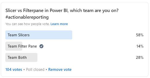
Overall the majority was rather opposing my standpoint and the survey also supports this:
Result of Survey
Supporting / Supplemental arguments
However some also supported my point of view such as Armand van Amersfoort performance argument.

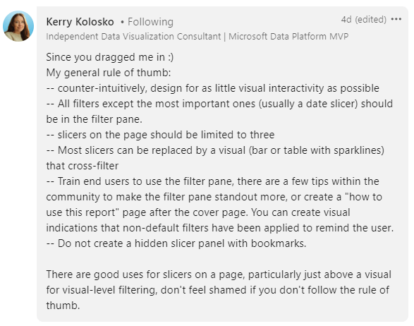
Or also Kerry Kolosko posted a great rule of thumb, which I support 100%
Opposing Viewpoint
If you are interested to read a completely opposite viewpoint than check out this great article from Johnny Winter:
