Power BI is a powerful tool for creating visually engaging and actionable reports, and in my opinion it is also the best tool to apply IBCS to its fullest potential. In case you would not know IBCS is a set of guidelines for creating effective and actionable reports that provide clear and actionable insights. If not check out my previous post. Power BI has many built-in features that can be used to achieve compliance with IBCS, and in this post, we will explore some ways to do so.
The first step to achieving IBCS with Power BI is to ensure that your data model is well-structured and organized. This means creating a clean and simple data model with a clear and consistent naming convention. Once your data model is organized, it is important to focus on creating clear and consistent visuals. Power BI has a wide range of visualizations that could be tailored to suit the specific needs of your report, but to start off with IBCS, one should focus on just two types of visuals and forget the rest:
- For categories: built-in table visual
- For time: line or column chart visuals
- IBCS with Power BI’s Built-In visuals
For an analysis with a focus on categories, you can use the table visual with conditional formatting. If needed, the bar and number can be split into multiple columns with a duplication of the measure just on this report not on the whole datamodel itself. Unlike the example below this would than allow that the bars don’t overlap the datalabel. Header and footer can be switched of and make both columns seem like one. As shown in both tables in the example below, the conditional formatting for bars on the table for each column will eventually create a multi-tier bar chart. This shows that once conditional formatting is applied, a table is not too far off from a bar chart.
For an analysis with a focus on time, you can use two or three visuals and make it seem like it is one visual. For the deviations chart make sure the axis font color is white. This is better than disabling the x-axis as a whole, to make sure the chart with actuals and the chart with deltas is equally spaced. This will create a multi-tier column chart, with two or three layers. Using this approach makes it easy to compare different measures over time.
Example of IBCS with Power BI’s built-in visuals:

It’s important to note that the table visual and line or column charts are not the only way to achieve IBCS compliance, and it’s important to test and try different visualizations, while following the IBCS guidelines and best practices to see which one works best for your data, and the story you want to tell with your report.
2. Design your Own Visual
Another way to achieve IBCS with Power BI is by creating your own visuals using Charticulator, which is now a community version created by Ilfat Galiev. Charticulator allows you to create customized visuals that can be tailored to suit the specific needs of your report. There is also a great IBCS tutorial on this by Curbal, which can guide you on how to use Charticulator to create IBCS compliant visuals. Curbals charticulator IBCS tutorial
Another open-source alternative is creating your own IBCS visual with Deneb. EnterpriseDNA has a good introduction video about this: Using Deneb For Flexible Custom Visuals In Power BI – YouTube
3. IBCS with Custom Visuals
Finally, you can use external IBCS Custom Visual Providers such as, Zebra BI, xViz Variance Chart / Inforiver, TrueChart4PowerBI, Graphomate, 3agsystems and many other. These providers offer a wide range of custom visuals that can be used to create clear and engaging reports. Each one of these custom visuals has a different set of features and functionality that can be used to create different types of reports.
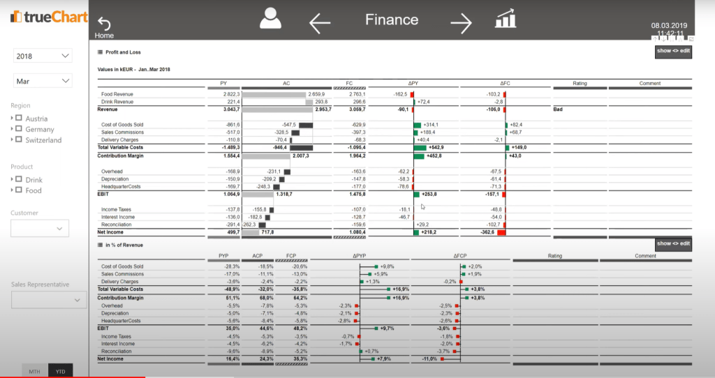
Zebra BI is great if your focus is financial and business reporting, but also has proven success other areas. Most likely Zebra BI is the leader in this market segment. In my opinion the main differentiator to the other IBCS custom visuals is that even if report authors are unaware of IBCS, the compliance with IBCS will still be at a very high level. This is due to a strategy to have a clear differentiation between three custom visuals: charts, tables and card. To have additionally the option for small multiples or tables with a deep hierarchy at a blazing fast speed is also a differentiator. By default there is less customization and user input needed to achieve a high IBCS compliance just drop in your main measures and you are done. Lately Zebra BI has deployed also an Excel add in, to ensure consistency across platforms. This is a move back to the roots, coming originally from an Excel add in background. There was also a PowerPoint add in launched, almost at the same time with Power BI enabling this functionality with their storytelling capabilities. The following shows an example of a Power BI “Finance-App” with the current selection being the income statement.

xViz Variance Chart is a custom visual that allows you to compare two measures over time. It has a feature called ‘variance analysis’ that can identify the difference between two measures and can be used to create variance charts. This visual was now integrated into the IBCS and Microsoft certified Inforiver Visual. Inforiver enabling with another custom visual also write back functionality is a key differentiator to enable data modification of Budgeting or Forecasting use cases. If planning capabilities should be in Power BI or rather on a backend system is another topic for itself. One additional strength of this custom visual is that xViz has a whole suite of various other custom visuals, not considered or necessarily recommended under IBCS.

TrueChart4PowerBI is a set of custom visuals that are designed to create charts that are IBCS compliant as well. It includes a variety of chart types such as column, line, and area charts and has a feature that allows you to format your charts to adhere to the IBCS standard. TrueChart decided to have just one custom visual for all use cases, no matter if you want to do an analysis over time or categories or both.
One key differentiators is that commenting can be done in the report itself. This is crucial since it makes it easy to apply important “message” part of IBCS and therefore ensures that actual insights will be created and not just sticking with awesome visualizations. The visualization by itself is not a story.
Also TrueChart is a product from and by the company HICO Group / HighCoordination GmbH. This is a huge advantage since unlike its competitors e.g. Zebra BI or Inforiver they have numerous IBCS certified German native speaking consultants. So in case you don’t already have a companywide full “buy-in” for IBCS ensuring a successful adoption through additional external help is key.
One additional good thing is that TrueChart is also available for QlikView / QlikSense. So if you are coming from a hybrid environment in that area and want to ensure a smooth migration from Qlik to Power BI than TrueChart is definitely worth considering.
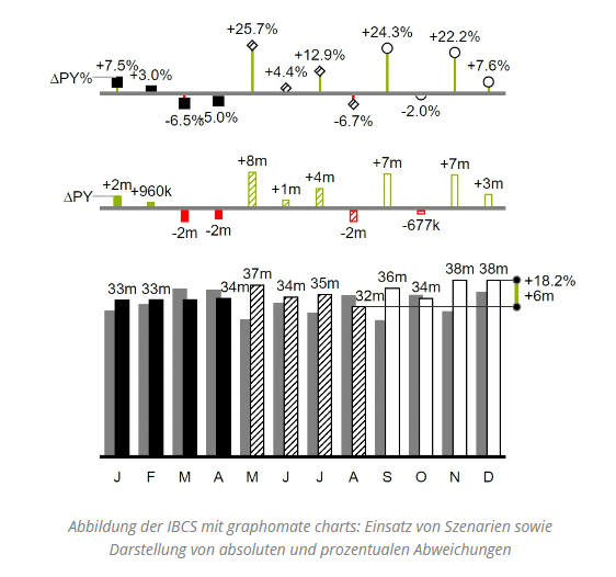
Graphomate is also a great custom visual when it comes to IBCS implementation. Just like Zebra BI Graphomate also follows the approach to offer multiple custom visuals depending on the use case, such as: charts, matrix, bubbles, pictograms, tiles. In addition to offering a highly customizable custom visual, one key differentiator is that Graphomate is also available for SAP and Tableau. So if you are having a hybrid environment with those tools, than this is custom visual is definitely worth considering. One strength as shown in the picture below is that it can have various scenarios in one visual, such as actual, forecast and than switching to plan. The definition of outlier detection is definitely also not something I have seen with other providers.
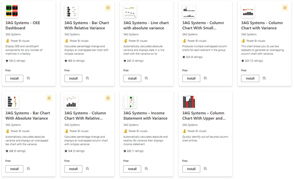
3agsystems’ custom visuals focus is also definitely IBCS. To come straight to the point the main strength of this custom visuals is that it is free. It might not have the power of the other mentioned custom visuals but it is still very close to the IBCS standards and also integrates the multiple deviation tiers into one visuals. One thing which is special is that line, column and small multiple are separate visuals. Other IBCS custom visual providers have decided to make this one visual, because those visuals are serving all the same purpose of an analysis over time. Furthermore, to confuse a bit even more 3agsystems’ custom visuals are split depending on whether you need an absolute or relative variance. The other custom visuals have the option to have absolute and percentage deviation in one chart as multiple tiers.
In conclusion, each one of these custom visuals provides different set of features and capabilities and you should evaluate them based on the specific needs of your report and use case. Keep in mind that this is not a comprehensive list and there might be other custom visuals with a focus on IBCS available for Power BI.

Hi Alexander,
I have been trying to emulate your column chart example in the ‘1.IBCS with Power BI’s Built-In visuals’ section above. I have used both line (to create lollipops) and column charts for top variance chart above base chart (stacked column) and I cannot get the 2 charts columns to align for same time period (x-axis). The recommendation to colour axis text white does not make any difference.
Q)
-Which visuals did you use to achieve the example shown ?
-Any other suggestions to achieve with built-in visuals ?
Thanks & kind regards
LikeLike
Hi Mal, great point.
– I used standard core visuals. Not really core visuals but deneb is great to. Or alternatively matrix+svg solutions. Follow
– Yes the alignment, was challenging for me at times as well.
Here is a super simple sample, I hope this helps. PBI-Tools/IBCS Template Adventure Works.pbix at main · KornAlexander/PBI-Tools (github.com)
As an alternative I can also recommend to use the core small multiple charts and add the tiers with a calculation group. This would have the benefit of still having one chart.
Also I can recommend to check Aleksandra Godlewska’s and Andrzej Leszkiewicz’s work. Great stuff as well here.
Ping me via LinkedIn in case I can help any further here.
LikeLike