Jumpstart Your Fabric Environment: A Real Demo on Real Data — in One Line

Jumpstart your Fabric environment with a real demo on real data — in a single line.

import fabric_jumpstart as jumpstart
jumpstart.install("hochschul-insights")

About three minutes later you have a complete German higher-education analytics stack in your workspace — a Lakehouse, a Direct Lake semantic model, an 8-page IBCS report with an Azure Map of all 422 Hochschulen, a pipeline and a Data Agent — all built on real public DESTATIS GENESIS data. No toy sample data, no manual wiring.

This is the first in a new Fabric Demo Series — small, opinionated, end-to-end demos that you can install into your own Microsoft Fabric workspace in a single click and play with right away. More demos coming soon (Defense, Retail, Health, Automotive — all GENESIS-powered).

What is Hochschul-Insights?

A complete German higher-education analytics demo, built on real public DESTATIS GENESIS data, enriched with Wikidata (city + geo) and wrapped in an IBCS-styled Direct Lake report. Eight pages, an Azure Map, a Data Agent for natural-language Q&A, and a single notebook to deploy the whole thing.

Hochschul-Insights report home page

What you get in your workspace

  • Lakehouse hochschul_insights_lh (schemas enabled, schema Genesis) with 16 Delta tables (10 facts, 6 dimensions).
  • Notebooks — an 00_start_here entry point, a snapshot loader, the GENESIS Loader (DESTATIS REST API) and a Wikidata-enriched Dimensions notebook.
  • Data Pipeline hochschul_insights_pipeline orchestrating parallel loads.
  • Direct Lake Semantic Model HochschulInsights with calculated calendar + IBCS measures.
  • Report HochschulInsights — 8 pages, IBCS layout, Azure Map of all 422 Hochschulen.
  • Data Agent hochschul_stats_agent for natural-language Q&A on the model.

Two install modes

The installer supports two flavours, and you pick by whether you paste a token or leave it empty:

  • Snapshot mode (default, no token) — loads bundled CSV snapshots from the public GitHub repo. Fastest path to “look at the report”, no signup needed. Finishes in a few minutes.
  • Live mode (free DESTATIS token) — runs the real pipeline: pulls fresh data from DESTATIS GENESIS, enriches with Wikidata, lands Delta, refreshes the model. ~10–15 minutes end-to-end. Schedule weekly afterwards.

How to install

Hochschul-Insights is now an official community Fabric Jumpstart, so the recommended path is a single line of Python.

Recommended — one line via Fabric Jumpstart

In any Fabric notebook:

%pip install -q fabric-jumpstart

import fabric_jumpstart as jumpstart
jumpstart.install("hochschul-insights")

About 3 minutes later (snapshot mode) the whole stack lands in a single hochschul-insights workspace folder. Then:

  1. Open the hochschul-insights folder and the 00_start_here notebook.
  2. (Optional, live mode only) register at www-genesis.destatis.de, copy your free username token and paste it into the parameters cell. Leave it empty for snapshot mode.
  3. Hit Run all, then open the HochschulInsights report.

No az login, no pip install, no environment variables — the Jumpstart authenticates via notebookutils, auto-detects your workspace and deploys everything. To clean up, just delete the hochschul-insights folder; every item lives inside it.

In live mode you can watch the pipeline run from the same notebook — three parallel GENESIS loads, then the dimensions builder, then the semantic model refresh:

Hochschul-Insights data pipeline

A peek at the report

Eight pages, all IBCS-styled. Here is the live report — click around, it is the real thing (Publish to web, all public DESTATIS data):

Three pages are worth pointing out as you click through the embed above:

  • Home — the landing page: KPIs and a Top-10 university ranking. The hero block here is drawn by a self-made HTML viewer visual (more on that below).
  • Übersicht — totals across all 16 Bundesländer plus an Azure Map of all 422 institutions (lat/lon from Wikidata, City fallback).
  • Studenten — student counts broken down by Fächergruppe, Bundesland, Hochschulart and gender, with cross-filter scenarios baked in.

A self-made IBCS custom visual — built in a few prompts

The multi-tier bar chart on the Studenten page isn’t off-the-shelf — I built that custom visual myself, and that is almost the best part of the story: it went from “I wish Power BI had this” to working-on-the-page in well under an hour, with just a handful of prompts to an AI coding assistant.

It’s a purpose-built IBCS custom visual: AC bars with PY/PL reference markers and Δ / Δ% variance tiers, semantic green/red, all following the IBCS notation standard. It ships in two orientations — horizontal (bar) and vertical (column) — exactly the integrated variance chart the IBCS world loves and stock Power BI doesn’t include. One caveat: at the time of writing it isn’t scrollable yet, so very long category lists get clipped — that’s on the roadmap.

The takeaway: rolling your own Power BI custom visual used to be a side project. With an AI coding assistant it’s an afternoon — often less.

HTML viewer on the Home page

The hero block on the Home page is rendered by an HTML content viewer custom visual: it takes a measure that returns HTML/CSS and renders it live inside the report. That’s how the landing page gets its own typography, KPI tiles and layout without ever leaving Power BI. This one I didn’t build myself — it’s an existing custom visual — but it pairs perfectly with the self-made IBCS chart.

Behind the scenes — what makes this fun

  • Direct Lake on schemas-enabled lakehouse — no import, no scheduled refresh of the model.
  • Wikidata SPARQL for Hochschule geolocation (EF1 + lat/lon, City fallback for the half-dozen missing ones).
  • IBCS measures — units calc group, semantic colours, scenario shading.
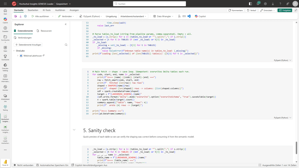
  • Loader notebook is pure PySpark + requests + pandas — no add-ons, runs on the default Fabric runtime:
Hochschul-Insights GENESIS Loader notebook

Take it further — build your own

Don’t stop at this demo. Open GENESIS-Online, pick any of the thousands of other tables, swap them into the loader notebook and you have your own end-to-end report in an afternoon. GENESIS is a gold mine: population, labour market, energy, prices, foreign trade, construction, healthcare, agriculture, tax, transport — there is something relevant for every company. Use this demo as the template, point it at the stats that matter for your business, and ship.

Your turn — contribute your solution

The Fabric Jumpstart catalog is a community effort, and this demo is my contribution. Big thanks to Miles Cole for the guidance that got Hochschul-Insights into the catalog — the whole process was smooth because of it. If you have built something end-to-end on Fabric, package it as a Jumpstart so anyone can install it in a single line. So: when will you contribute your solution?

Get it

Fabric Jumpstart (one-line install): jumpstart.fabric.microsoft.com/catalog/hochschul-insights

Source repo: github.com/KornAlexander/hochschul-insights

Data licence (DESTATIS GENESIS): Datenlizenz Deutschland 2.0 — commercial use OK with attribution.

The Future Is Vibecoding: Why I’d Pick Rayfin Over Power Apps Every Time

⚠ Disclaimer: This is my personal opinion and a deliberately bold, provocative take – not Microsoft’s official positioning, and not a statement on behalf of the Power Platform or Fabric teams. Rayfin is an early, evolving product; Power Apps remains the right choice for many scenarios. Read this as one enthusiast’s perspective, not product guidance.
Rayfin apps in Microsoft Fabric

TL;DR – why Rayfin is the clear successor to Power Apps:

  • Vibecoding is the future. You describe the app in plain language; GitHub Copilot writes the code. Hand-coding is on its way out.
  • You don’t need to be a developer. I can’t write a line of TypeScript – yet I shipped a live, authenticated app into Fabric in minutes.
  • Safe by design. Your app is locked inside your Fabric ecosystem: Entra identity, workspace governance, data in your own tenant.
  • No per-seat tax. It runs on the Fabric capacity you already own – and hosting plus authentication are free.
  • No ceiling, no lock-in. You get real, owned, portable code instead of a proprietary canvas artifact you can never export.
  • The only open question isn’t if you’ll move off Power Apps – it’s when.

Let me say the quiet part out loud: the future is vibecoding. Soon, no one will write code by hand.

Not “fewer people.” Not “vibecoding only for prototypes.” No one. And to be clear: this isn’t vibecoding only for prototypes — it’s vibecoding for the real, production app you actually ship. You’ll describe what you want in plain language, an agent will write the code, and you’ll ship it. The keyboard-warrior phase of software – memorising syntax, fighting a proprietary formula language, googling error messages at midnight – is ending. And the funny thing is, the people who’ll benefit most aren’t developers at all. They’re the rest of us.

I know, because I’m one of them.

I can’t write a single line of TypeScript – and I shipped anyway

Here’s my confession as a data platform person: I am not a developer. I cannot write a single line of TypeScript, React, or anything that compiles. And yet, a couple days ago, I published a real, authenticated, data-backed web application into Microsoft Fabric – with nothing but GitHub Copilot and an idea. Minutes. Not hours. Not days.

That app was the IBCS Trainer – a little Jump & Run game that teaches IBCS rules by stomping on bad charts. Behind the silly premise sits something serious: it runs as a Rayfin app inside Fabric, it signs users in with their Entra identity, and it writes every play-through into a typed database that I can query with plain SQL afterwards. I didn’t stand up a database. I didn’t configure an App Service. I didn’t open a single infrastructure ticket. I described what I wanted, Copilot wrote it, and one command put it live next to my lakehouse. And a couple of minutes later I had three additional sample Rayfin apps from awesome Rayfin deployed.

If you’d told me a year ago that the non-coder in the room would ship a governed app faster than a Power Apps specialist could wire up a canvas – I’d have laughed. Today it’s completely normal.

So what is a Rayfin app?

Rayfin is a backend-as-a-service that lives inside Microsoft Fabric. You write a front-end (or let Copilot write it for you), and Rayfin provisions everything behind it: a real SQL database in Fabric, a typed data API, authentication, and static hosting – all as a Fabric item. One command, rayfin up, builds it and hands you a live URL.

How a Fabric app fits together

The part that matters for people like me:

  • Your app lives where your data lives. Fabric stops being “just reports and pipelines” and becomes a place you can host the things people actually click on.
  • Governance comes for free. The app inherits your Fabric workspace permissions and Entra identity. Your IT and security teams already know how to govern it – there’s nothing new to approve.
  • It’s genuinely fast to ship. Idea to authenticated, live, governed app in a single deploy command.

That’s the whole pitch, and it holds up.

Vibecoding beats learning the Power Apps UI

Now the spicy bit. People will say: “But Power Apps is for non-developers. Vibecoding still needs a coder.”

That’s backwards. Learning Power Apps is learning to code – just in a worse, proprietary language that’s useless everywhere else. You still have to master Power Fx formulas, delegation limits, connector quirks, the canvas property model, environments and solution layers. That’s a steep, single-vendor skill tree, and the moment you hit its ceiling, you’re stuck.

Vibecoding asks me to do the one thing I already do effortlessly: describe what I want.

Creating a Fabric app the easy way

“Build me a form to log site inspections with a photo and a date, and show me last week’s entries.” That sentence is easier than building the same thing on a canvas – no formulas, no delegation warnings, no connector configuration. The agent writes the code; I review the working result. And when I want to change it, I don’t go re-learn where a property hid in some designer two years ago. I just say: “add a status column and a filter for open items.” Maintenance is a conversation, not a re-certification.

Best of all, the skill I’m building – describing software – transfers everywhere. The hours someone spends mastering Power Fx buy them nothing outside Power Platform. That’s a dead-end investment in a world that’s moving to language as the interface.

Your app is locked safely in your Fabric ecosystem

Here’s the line that makes security teams relax instead of panic: your vibecoded application is fully safe, because it’s locked safely inside your Fabric ecosystem.

This isn’t a random web app deployed to who-knows-where. A Rayfin app is a Fabric item. That means:

  • Identity is Entra, brokered by Fabric. Sign-in and sessions are handled by the platform, not by some hand-rolled auth you have to trust.
  • Access is workspace permissions. The same governance model that protects your lakehouses and semantic models protects your app. No new perimeter, no shadow IT.
  • The data stays in Fabric. Every write lands in a real Fabric SQL database in your tenant, under your capacity, inside your compliance boundary – queryable for Power BI like everything else you own.

So when a non-developer ships an app this way, it isn’t a liability hiding in a corner. It’s a first-class, governed citizen of your data estate. That’s the opposite of the classic low-code sprawl problem.

But what does it actually cost?

Fair question – and the answer is refreshingly boring, which is exactly what you want.

A Rayfin app runs on the Fabric capacity you already have. There’s no per-user license, no per-app license, no premium-connector tax. It simply draws Capacity Units (CUs) from your workspace, and you watch it in the Fabric Capacity Metrics app like any other workload. (Full pricing details on Microsoft Learn.)

Only three things consume capacity:

  • SQL Database – compute for every query and write, plus storage for your tables. (For the nerds: one Fabric CU equals 0.383 SQL database vCores.)
  • GraphQL API – the typed data layer your app calls. Billed at ten CUs per hour of request-and-response processing time – so you pay for actual usage, not for it sitting idle.
  • OneLake storage – your built front-end (HTML, CSS, JS) when static hosting is on, plus the read/write operations to serve it.

And here’s the part Power Apps can’t match – what’s free:

  • The app hosting service – API routing and the application backend. No charge.
  • Authentication – Entra SSO sign-in and session management. No charge.
  • Deployment – running rayfin up itself costs nothing beyond the storage operations it triggers.

Read that again: hosting and authentication – the two things you’d normally pay a platform tax for – are included. If you already run Fabric, your app essentially rides along on capacity you’ve already bought. Compare that to stacking per-user Power Apps licenses on top of everything else, and the math gets uncomfortable for the incumbent very quickly.

When will you switch your Power Apps to Rayfin?

Here’s the whole argument on a single screen:

Power Apps Rayfin in Fabric
How you build Learn Power Fx + the canvas designer Describe it; Copilot writes the code
Who can build A trained maker Anyone who can describe an app
Where it lives A separate Power Platform environment A Fabric item, right next to your data
Identity & governance Separate environment and DLP setup Entra + Fabric workspace permissions, built in
Pricing Per-user / per-app licenses Fabric capacity you already own — hosting + auth free
The code Opaque, locked to the platform Real, owned, portable code
Ceiling Hit the wall and you’re stuck Drop into the code — no ceiling

So I’ll leave you with the question I keep asking colleagues: which of your apps no longer needs a canvas?

Because the trade-off that justified low-code is gone. You no longer give up control to get speed – vibecoding gives you both. You get real, owned, portable code instead of an opaque artifact. You get Fabric-grade governance instead of low-code sprawl. You get capacity-based pricing instead of a per-seat tax. And you get all of it without writing a line of code yourself.

I’m a reporting person who can’t code, and I shipped a governed app into Fabric in minutes. If I can do that, your next internal tool, data-entry front-end, or little team app doesn’t belong on a canvas anymore.

The future is vibecoding. The only question is which of your apps you’ll build differently from here on.


If you’re building on Fabric, take Rayfin for a spin. And if you want to see what a non-developer can actually ship with it, go stomp some pie charts in the IBCS Trainer – that whole game is a Rayfin app.

Unlimited Power BI Usage History — Snapshot the Built-In Usage Metrics Model to Lakehouse

Power BI’s built-in usage metrics report is great — until you need history beyond 30 days. The underlying dataset is a rolling window: yesterday’s view counts are there, last quarter’s are gone. If you want to track adoption trends, prove ROI, or spot reports that have quietly died, you need to capture that data yourself.

The fix is surprisingly simple: a single Fabric notebook that queries the hidden Report Usage Metrics Model semantic model over XMLA and appends each daily snapshot to Lakehouse Delta tables. Unlimited history, append-only, ~30 lines of Python.

Usage Metrics Snapshot architecture

Honest Disclaimer — Prefer FUAM

Before you build this: if you have any meaningful scale of Power BI / Fabric tenant, use FUAM (Fabric Unified Admin Monitoring) instead. FUAM is the Microsoft-published, open-source accelerator that snapshots not just usage metrics but capacity events, activity logs, refresh history, inventories — the whole tenant story — into a Lakehouse with a ready-made semantic model and report. It is far more complete than what’s in this post.

So when do I reach for the little notebook below instead?

  • A single workspace where you just need report-level view history and don’t want to deploy a full monitoring solution.
  • You need a quick fix today and FUAM rollout is weeks away.
  • You want to understand how the underlying mechanism works — the notebook is small enough to read end-to-end in five minutes.

For everything else: start with FUAM.

The Problem: 30 Days Is Not Enough

  • Rolling window. Each day, the oldest day falls off. Anything older than 30 days is permanently gone — you cannot recover it.
  • No YoY, no trends. Did adoption grow over the last year? Which reports are losing users? You literally cannot answer these questions with the built-in model.
  • No ownership. Microsoft controls the model. Schema changes happen without notice. You cannot extend it, share it, or join it to your own dimensions cleanly.

The Solution: Daily Snapshot to Lakehouse

The hidden Report Usage Metrics Model is a normal semantic model — it just happens to be auto-managed by Microsoft. That means you can hit it with XMLA queries like any other model. Using sempy.fabric.evaluate_dax, we pull each source table, stamp a SnapshotUtc column, and append to Delta tables in a Lakehouse:

import sempy.fabric as fabric
from datetime import datetime, timezone

WORKSPACE_ID = "<your-workspace-guid>"
DATASET_NAME = "Report Usage Metrics Model"
TABLES = ["Views", "Reports", "Users", "Dates", "DistributionMethods", "Platforms"]

snap_ts = datetime.now(timezone.utc)

for t in TABLES:
    df = fabric.evaluate_dax(
        dataset=DATASET_NAME,
        workspace=WORKSPACE_ID,
        dax_string=f"EVALUATE '{t}'",
    )
    df.columns = [c.split("[")[-1].rstrip("]") if "[" in c else c for c in df.columns]
    df["SnapshotUtc"] = snap_ts.isoformat()
    (spark.createDataFrame(df).write
        .mode("append")
        .option("mergeSchema", "true")
        .saveAsTable(f"usage_metrics_{t.lower()}"))

That’s the whole engine. Schedule it daily after 04:00 UTC (the source refreshes around 03:00 UTC) and you have a permanent historical record.

What Lands in the Lakehouse

One Delta table per source table, prefixed usage_metrics_*, with an extra SnapshotUtc column. Append-only — every run adds today’s full snapshot.

Source tableLakehouse tableRole
Viewsusage_metrics_viewsFact
Reportsusage_metrics_reportsDimension
Usersusage_metrics_usersDimension
Datesusage_metrics_datesDimension
DistributionMethodsusage_metrics_distributionmethodsDimension
Platformsusage_metrics_platformsDimension

Three Design Decisions Worth Calling Out

  • Append, not merge. Every snapshot is the full 30-day window. Yes, days overlap across snapshots — but storage is cheap and append is bulletproof. Deduplication happens at query time (see below), not at ingest time.
  • mergeSchema=true. Microsoft occasionally adds columns to the usage metrics model. With schema merging on, the next snapshot just absorbs the new columns instead of crashing.
  • Retention with DELETE. Default 400 days (≈13 months, enough for YoY) — but you can set RETENTION_DAYS = None to keep forever. The delete is a normal Delta operation, so time travel still works if you mess up.

Querying Without Double-Counting

Because every snapshot contains the last 30 days, the same activity row appears in up to 30 snapshots. To get clean numbers, take the latest snapshot per natural key:

WITH ranked AS (
    SELECT v.*,
           ROW_NUMBER() OVER (
               PARTITION BY Date, ReportGuid, UserGuid
               ORDER BY SnapshotUtc DESC
           ) AS rn
    FROM usage_metrics_views v
)
SELECT Date,
       ReportGuid,
       COUNT(*)                  AS views,
       COUNT(DISTINCT UserGuid)  AS distinct_users
FROM ranked
WHERE rn = 1
GROUP BY Date, ReportGuid
ORDER BY Date DESC, views DESC

For older history (where a date appears in only one snapshot), the deduplication is a no-op — the row simply passes through. For the most recent 30 days, you always pick the freshest version of each fact.

Prerequisites

  • Workspace on Premium / PPU / Fabric capacity (XMLA endpoint enabled — read is enough).
  • The Report Usage Metrics Model dataset exists in the workspace. It is auto-created the first time anyone clicks More options → View usage metrics report on any report in that workspace.
  • A Lakehouse attached to the notebook (any Lakehouse in the same workspace works).
  • Tenant setting “Usage metrics for content creators” enabled (admin portal).

Try It — Fabric Notebook Gallery

The notebook is also submitted to the Fabric Notebook Gallery. Grab the .ipynb directly from GitHub and import it into any Fabric workspace:

📓 Usage Metrics Snapshot.ipynb — one notebook, six Delta tables, daily schedule. Set WORKSPACE_ID, attach a Lakehouse, schedule after 04:00 UTC. Done.

Take It Further — A Power BI Report on Top

The Lakehouse tables are already the hard part. From here, building a proper Adoption & Usage Power BI report is a short hop:

  • Point a Direct Lake semantic model at the six usage_metrics_* Delta tables — no import, no refresh schedule, fresh on the next snapshot.
  • Wrap the "latest snapshot per natural key" dedup logic in a SQL view in the Lakehouse SQL endpoint so the model stays simple. One view per fact, deduped, ready to consume.
  • Build the obvious pages: Adoption over time (views & distinct users by month, YoY), Top & bottom reports, Dying reports (had >X views last year, <Y this quarter), Platform & distribution mix.
  • Join to your own Reports dim (owner, business domain, criticality) for actionable cuts — e.g. "critical reports with zero views in 30 days".

That’s the whole point of owning the history: once the data lives in your Lakehouse, you can model and visualise it however your stakeholders need — not however Microsoft’s built-in report happens to ship it.

Wrap-Up

One notebook, one daily schedule, six Delta tables — and the 30-day blind spot is gone. You own the history, you can join it to your own data, and you can build proper adoption dashboards on top.

The full notebook (with retention, health-check, and example query cells) is on GitHub: KornAlexander/PBI-Tools → Notebook Gallery / Usage Metrics Snapshot.ipynb.

Power BI Report Prototyping with AI: From 35 Pages to 18 in 10 Minutes

Power BI Report Prototyping with Excalidraw and Copilot Agent Mode

How I used GitHub Copilot Agent Mode, Playwright MCP, and Excalidraw to prototype a Power BI report redesign — automatically.

1. The Problem

You have a Power BI report with 35 pages and 5 levels of drill-through navigation. Users get lost. Pages are hard to maintain. You want to redesign the navigation — but how do you plan it visually before touching a single Power BI file?

Traditional approaches involve:

  • Opening the report and clicking through pages manually
  • Sketching boxes on a whiteboard
  • Creating mockups in PowerPoint

None of these give you a connected view of what exists (screenshots of every page) alongside what should change (proposed page hierarchy).

2. The Solution: AI-Powered PBI Prototyping

I built a workflow that combines three tools:

  1. Playwright MCP — automatically screenshots every page of a Power BI report
  2. Excalidraw — organizes screenshots with labels, levels, and before/after comparison diagrams
  3. PBIR files — extracts the actual page navigation graph from the report definition

All orchestrated by GitHub Copilot in Agent mode inside VS Code.

Power BI Report Prototyping Process — automated workflow using Copilot Agent Mode

The complete prototyping workflow — from opening the report to the final Excalidraw file.

3. Screenshot Every Page with Playwright

Power BI renders visuals on <canvas> elements — there’s no way to extract the visual content as DOM elements. Screenshots are the only viable approach.

Using the Playwright MCP server in VS Code, Copilot navigates to the report, opens the page dropdown at the bottom, and loops through every page — clicking each one, waiting for visuals to render, and taking a screenshot. The entire process is hands-free.

Key learnings:

  • Open the report in full-screen mode before running the script — avoids capturing sidebars and filter panes
  • Wait 4 seconds per page for visuals to render (8 seconds for complex pages)
  • For non-default tenants, launch Edge with --remote-debugging-port=9222 and connect Playwright via CDP

Result: 35 clean, full-screen screenshots in under 3 minutes.

4. Extract Page Navigation from PBIR Files

Instead of manually mapping which pages link to which, I export the report’s PBIR definition via the Fabric REST API.

Every Power BI project (PBIP) consists of two parts: the PBIR (report definition) and the TMDL (semantic model definition). The PBIR contains a JSON file for every page and every visual — including the exact drill-through targets, button navigation actions, and page references. This means the complete navigation graph of the report is encoded in these files.

# Authenticate and export the report definition via Fabric REST API
Login-PowerBIServiceAccount
$uri = "https://api.fabric.microsoft.com/v1/workspaces/$workspaceId/reports/$reportId/getDefinition"
$response = Invoke-WebRequest -Uri $uri -Method Post -Headers $headers

# The API returns a long-running operation — poll until complete,
# then save all files locally (pages, visuals, assets, themes, ...)

By searching for cross-page references in the visual.json files, I can extract the complete navigation graph:

From: Page 1 (Overview) → To: Page 2a, Page 2b, Page 2c, ...
From: Page 2a → To: Page 3a, Page 3b, ...
From: Page 3a → To: Page 4a
From: Page 4a → To: Page 5a

This gives me the actual drill-through depth for every page — no guessing required.

Result: A complete navigation graph with hundreds of cross-page links, automatically determining that some sections have 5 levels of drill-through.

5. Build the Excalidraw Prototype

Excalidraw files are pure JSON — no special tools needed. I generate the entire prototype programmatically with Python. Screenshots are embedded as base64-encoded images directly into the Excalidraw JSON file, so the result is a single portable file with everything included.

Color-Coded Level Indicators

Each page gets a label with color coding based on its drill-through depth:

  • L1 (Teal) — Landing page
  • L2 (Blue) — First entry from overview
  • L3 (Purple) — Analysis pages
  • L4 (Orange) — History pages
  • L5 (Red) — Detail drill-through
  • TT (Gray) — Tooltip pages

Layout: Categories Horizontal, Pages Vertical

Categories are arranged as columns. Within each column, pages are stacked vertically in drill-through order. This gives an instant visual sense of which areas are deep and which are flat.

Before/After Comparison Diagrams

Below each category’s screenshots, I add box diagrams showing the current vs. proposed hierarchy:

BEFORE (12 pages, 5 levels)

[L1] Page 1
  └─ [L2] Page 2a
       ├─ [L3] Page 3a
       │    └─ [L4] Page 4a
       │         └─ [L5] Page 5a
       └─ [L3] Page 3b
            ├─ [L4] Page 4b
            └─ [L4] Page 4c

AFTER (5 pages, 3 levels)

[L1] Page 1
  └─ [L2] Page 2a
       ├─ [L3] Page 3a
       │    + Page 4a content (merged as table)
       │    + Page 5a content (merged as drill-through)
       └─ [L3] Page 3b
            + Page 4b content (merged as table)
            + Page 4c content (merged as chart)

Result: 35 pages → 18 pages. 5 levels → 3 levels. Clear visual comparison.

6. A Note on Figma

I also tried the Figma MCP server for this workflow. Figma’s capture can convert HTML pages into editable design layers — great for web UIs. I successfully captured the before/after box diagrams as editable Figma frames.

However, for Power BI prototyping specifically, Figma has limitations: Power BI renders visuals on <canvas> elements which are invisible to the capture script, the MCP is write-only (no editing existing layers), and each capture ID is single-use. If you need to share prototypes with designers already in Figma, it works as an additional output — but Excalidraw is the better primary tool because:

  • Full programmatic control — the JSON file format allows unlimited manipulation
  • No API limits or authentication required
  • Works offline in VS Code with the Excalidraw extension
  • Images, text, shapes, and arrows in a single portable file

7. The Complete Workflow

  1. Open PBI report in browser (Playwright MCP)
  2. Screenshot all pages (loop through page dropdown)
  3. Export PBIR definition (Fabric REST API)
  4. Parse navigation graph from visual.json files
  5. Build Excalidraw file with Python: embed screenshots, add labels, generate comparison diagrams
  6. Review in VS Code with Excalidraw extension
  7. Optionally capture to Figma for sharing

Total time: ~10 minutes for a 35-page report, fully automated.

8. Try It Yourself

Prerequisites

  • VS Code with GitHub Copilot (Agent mode)
  • Playwright MCP server (npx @playwright/mcp@latest)
  • Excalidraw VS Code extension (pomdtr.excalidraw-editor)
  • MicrosoftPowerBIMgmt.Profile PowerShell module

Quick start

  1. Open VS Code with GitHub Copilot (Agent mode)
  2. Install the Playwright MCP server (npx @playwright/mcp@latest)
  3. Open your Power BI report in the browser and copy the URL
  4. Ask Copilot: “Screenshot all pages of this Power BI report, download the PBIR definition, analyze the page navigation hierarchy, and create an Excalidraw file organized by category with level indicators and before/after comparison diagrams”

The AI handles the automation. You focus on the design decisions.

9. Beyond Prototyping: Visual Report Documentation

This workflow isn’t just for redesigning reports. It’s equally valuable as a documentation tool for important production reports:

  • Onboarding new team members — Instead of clicking through a 30-page report live, hand them an Excalidraw file with every page screenshot, labeled with descriptions and navigation hierarchy. They see the full picture in one canvas.
  • Change tracking — Run the screenshot workflow periodically and compare versions side by side. Visual diffs catch layout changes that text-based diffs miss.
  • Stakeholder communication — Share the Excalidraw file (or a Figma capture) with business stakeholders to discuss which pages they actually use, which are redundant, and where gaps exist.
  • Audit and compliance — For regulated environments, having a visual snapshot of every report page with timestamps serves as documentation of what was deployed and when.
  • Cross-team alignment — When multiple teams build reports in the same workspace, the navigation graph reveals overlaps, orphaned pages, and opportunities to consolidate.

The same 10-minute automated process that enables prototyping also produces comprehensive visual documentation — with zero manual effort.

What’s Next

  • Automated PBIR modification — Once the prototype is approved, programmatically update the report’s page structure to match the proposed design
  • Semantic model analysis — Apply the same prototyping approach to data model optimization
  • Template generation — Create reusable prototyping templates for common report patterns

Tools used: GitHub Copilot (Claude), Playwright MCP, Figma MCP, Excalidraw, Microsoft Fabric REST API, PowerShell, Python